Increasing blood pressure screenings in virtual primary care
UX Design, Service Design, User Research
Overview
Nearly 1 in 2 U.S. adults have hypertension (CDC), making screening a key part of primary care. In Teladoc Health’s virtual model, users must take their own readings—but many weren’t. This project focused on improving discoverability, guidance, and motivation, ultimately helping more users complete at-home blood pressure screenings.
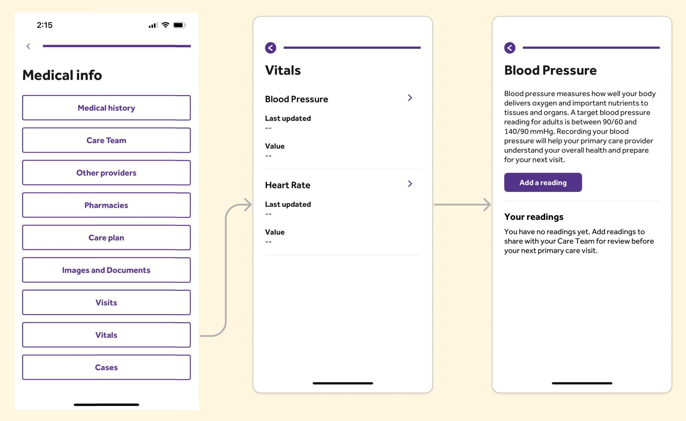
Before
Opportunity
Increase the percentage of screenings users complete and report to our system.
Reduce the burden of gathering these screenings on nurses.
Set new expectations for virtual-care that differ from physical-care.
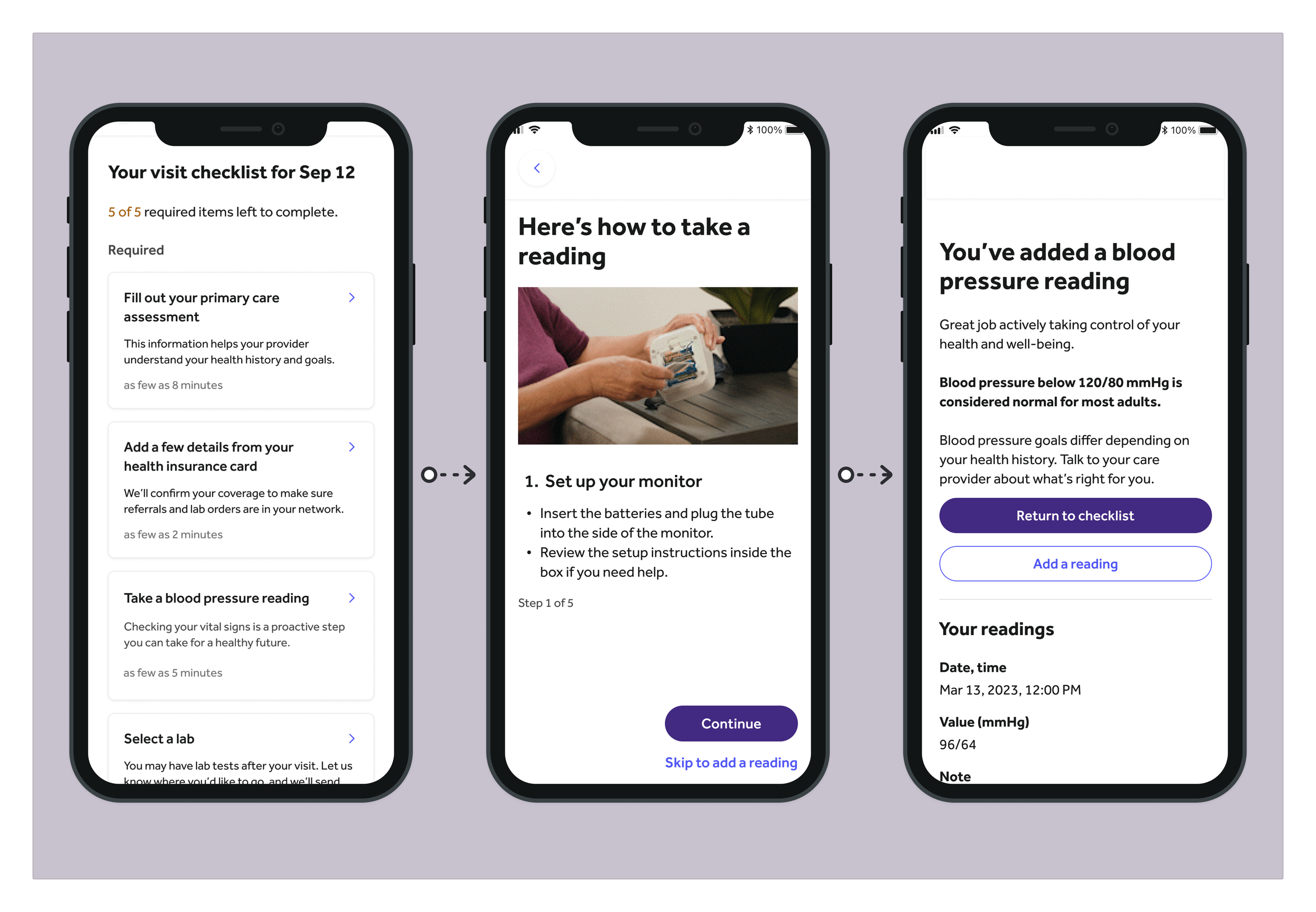
After (see larger below)
Outcomes
2,000% increase in self-screening.
Reduced nurse burden.
Clarified the strategy of blood pressure screening in our primary care service.
Team
My role Product design, service design lead, research lead
Collaborators Product manager, content strategist, clinical strategist, engineering lead, offshore development team
Highlights
Initial hypothesis: Insufficient uploads are a result of a manual upload process
Our product manager launched the project to enable Bluetooth syncing between users’ blood pressure monitors (sent when they schedule an appointment) and our app. The app had a page to manually enter their readings—a step he believed created too much friction. Automating the process aimed to remove that barrier and increase engagement.
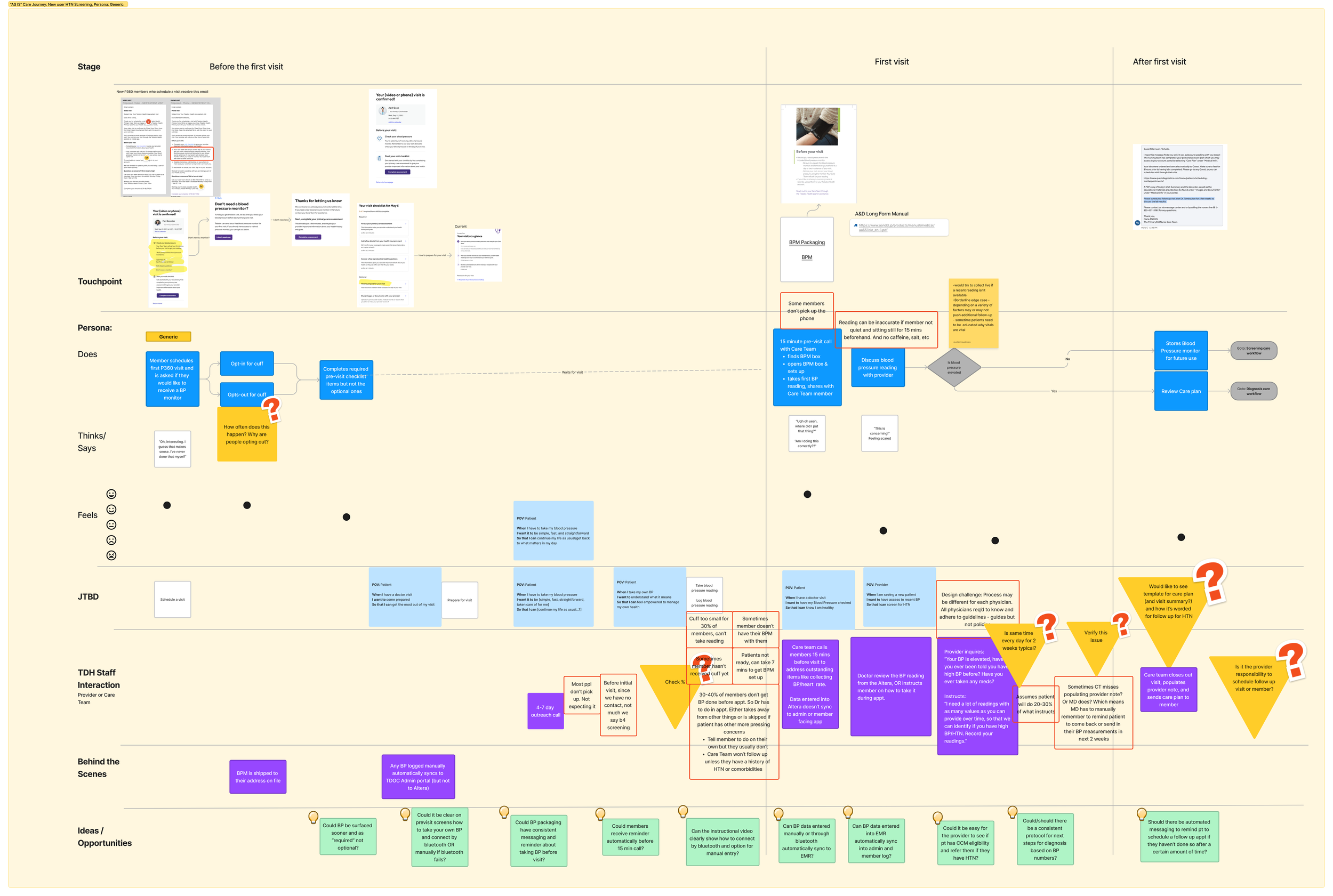
Our service blueprint of the existing system.
As part of our discovery, I led the development of a service blueprint to map internal and external user flows. We reviewed it with nurses, physicians, and checked analytics.
We quickly found our assumptions were off:
Fewer than 2% of users had ever used the existing feature—it was hard to find, and even providers didn’t know it existed.
Our visit prep messaging didn’t clearly ask users to take their own readings.
Nurses had to collect readings during visits, catching users off guard without their monitors. This ate up time and left other medical history incomplete.
Physicians asked users to log readings post-visit—but follow-through was rare.
New hypotheses: Make an explicit screening task and walk members through the process
An explicit blood pressure task in the pre-visit checklist, paired with motivating framing, will drive self-completion.
Consistent messaging across touchpoints will clarify when and how to take a reading.
Bluetooth connectivity may still ease the logging process.
Clear guidance on technique will improve measurement accuracy and confidence.
We worked with our physician advisors to reduce barriers
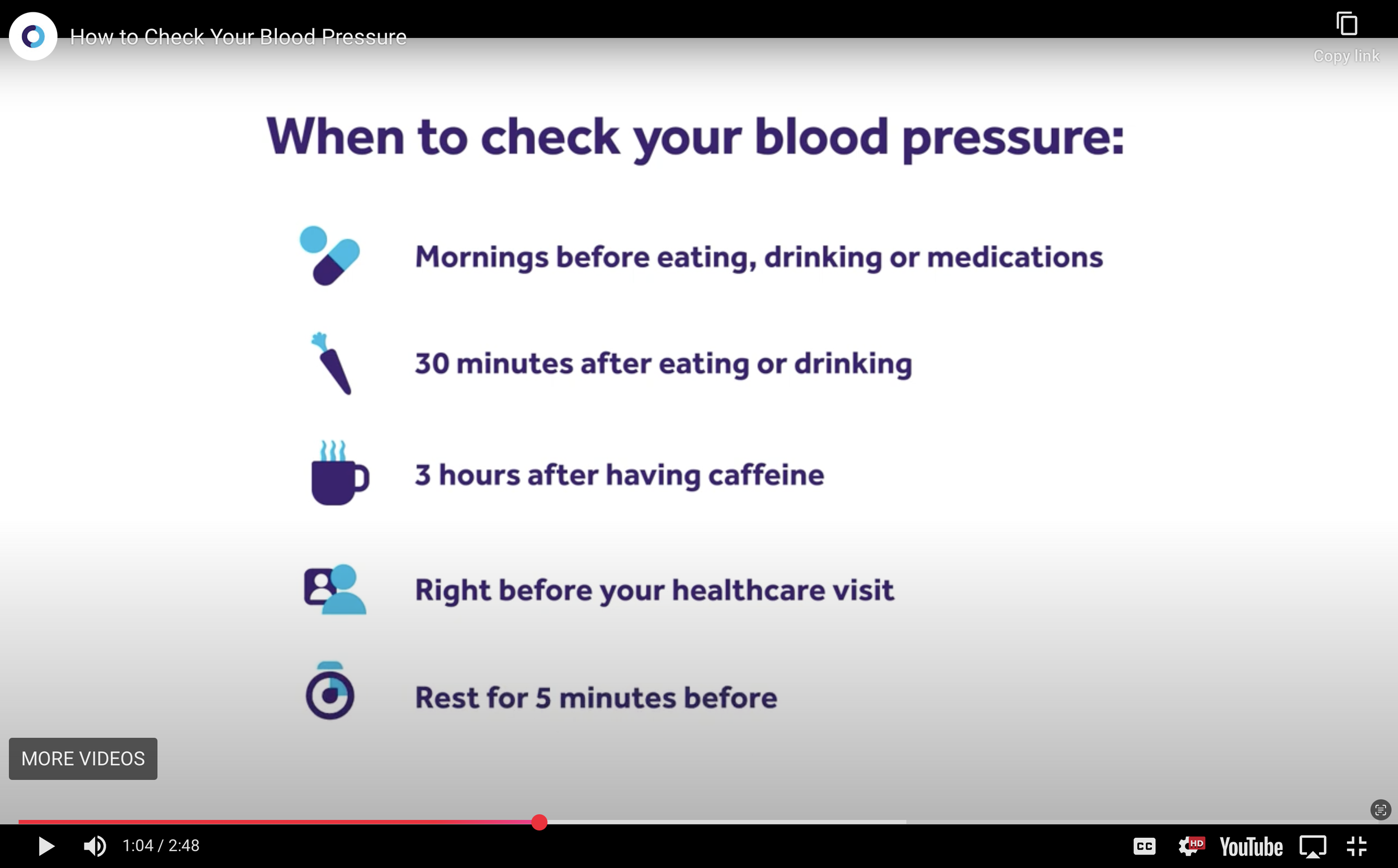
A previously made video communicating stringent guidelines for taking blood pressure.
Our clinical strategy for primary care followed the stricter guidelines of our hypertension program. But guiding users to meet all criteria before their first reading posed major risks to task completion. After consulting our clinical advisors, we got buy-in to lower the initial barriers. If the first reading was high, physicians could follow up with guidance—by then, users would be more familiar, engaged, and likely to comply.
We built on past learnings to create concepts
To save development time and build on past learnings, we looked to our existing hypertension program for guidance. We reused features where possible—like illustrations—and adapted copy to better fit the needs identified through our research personas.
However, our hypertension program users differ from primary care users. The former are familiar with blood pressure and often self-monitor, while the latter typically rely on nurses and have little knowledge or experience.
This raised key questions:
Where will these designs work—and where will they fall short?
How do we motivate users to engage with something unfamiliar?
What’s the right balance of instruction?
Will Bluetooth setup feel worth the effort?
We identified motivational messaging and how to make our designs more effective through testing
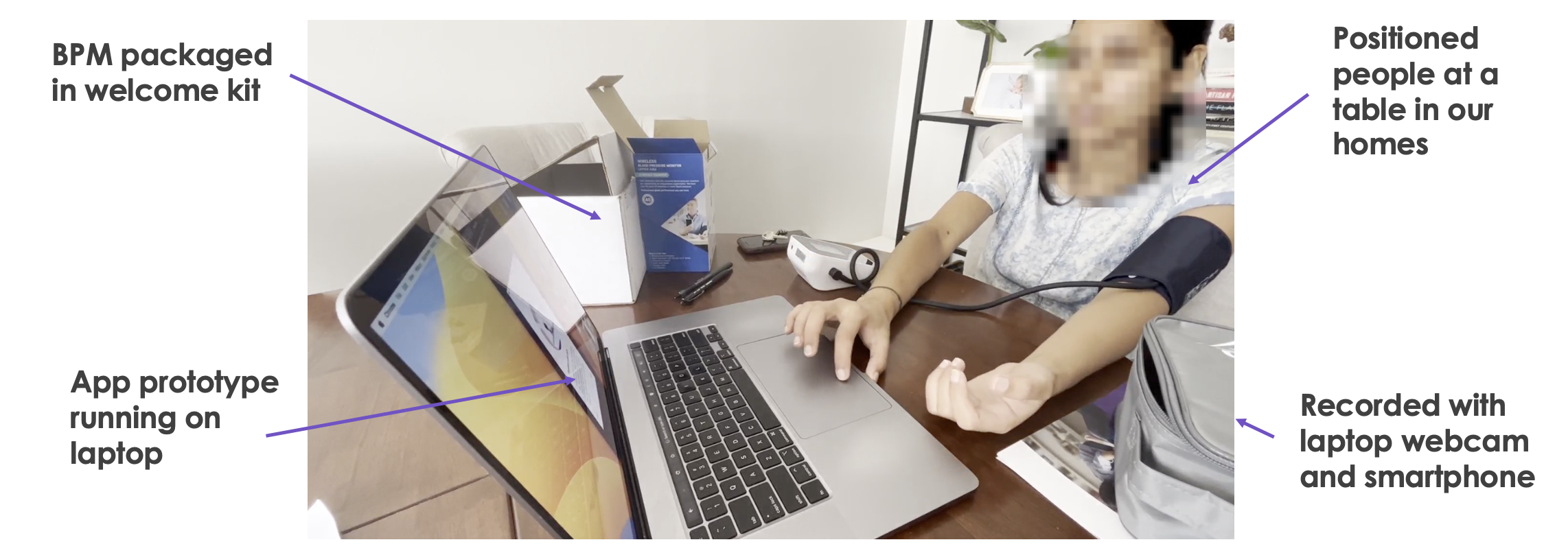
To test our hypotheses, we ran a fast-paced, in-person concept study—planned, recruited, and launched within two weeks, with testing and analysis completed in the next two. To stay agile, we recruited neighbors and acquaintances who still reflected our user base and inclusivity goals.
Participants explored motivational messages and used our clickable prototype to take their blood pressure, with access to the current instructional video.
Key insights:
Prevention messaging was the most motivating.
Instructions lacked clarity—illustrations, animations, and text didn’t provide enough detail.
Flow didn’t fit all users—some wanted every step, others wanted to skip ahead. The video felt long; bite-sized content was preferred.
Optional tips felt overwhelming mid-flow but were appreciated at the end.
Bluetooth syncing felt more burdensome than manual entry.
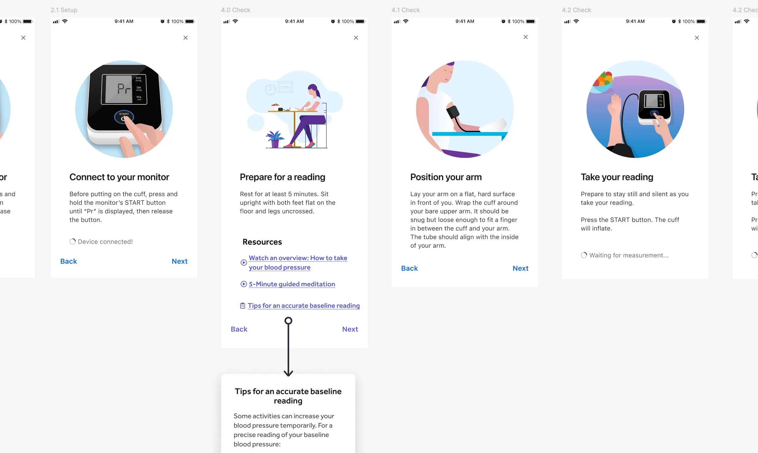
The solution: Bite-sized live-action GIFs
Previously, the ask to take a blood pressure reading was hidden within an optional pre-visit task card that most users overlooked. There were also no clear instructions on how to take a proper reading.
To address these gaps, we:
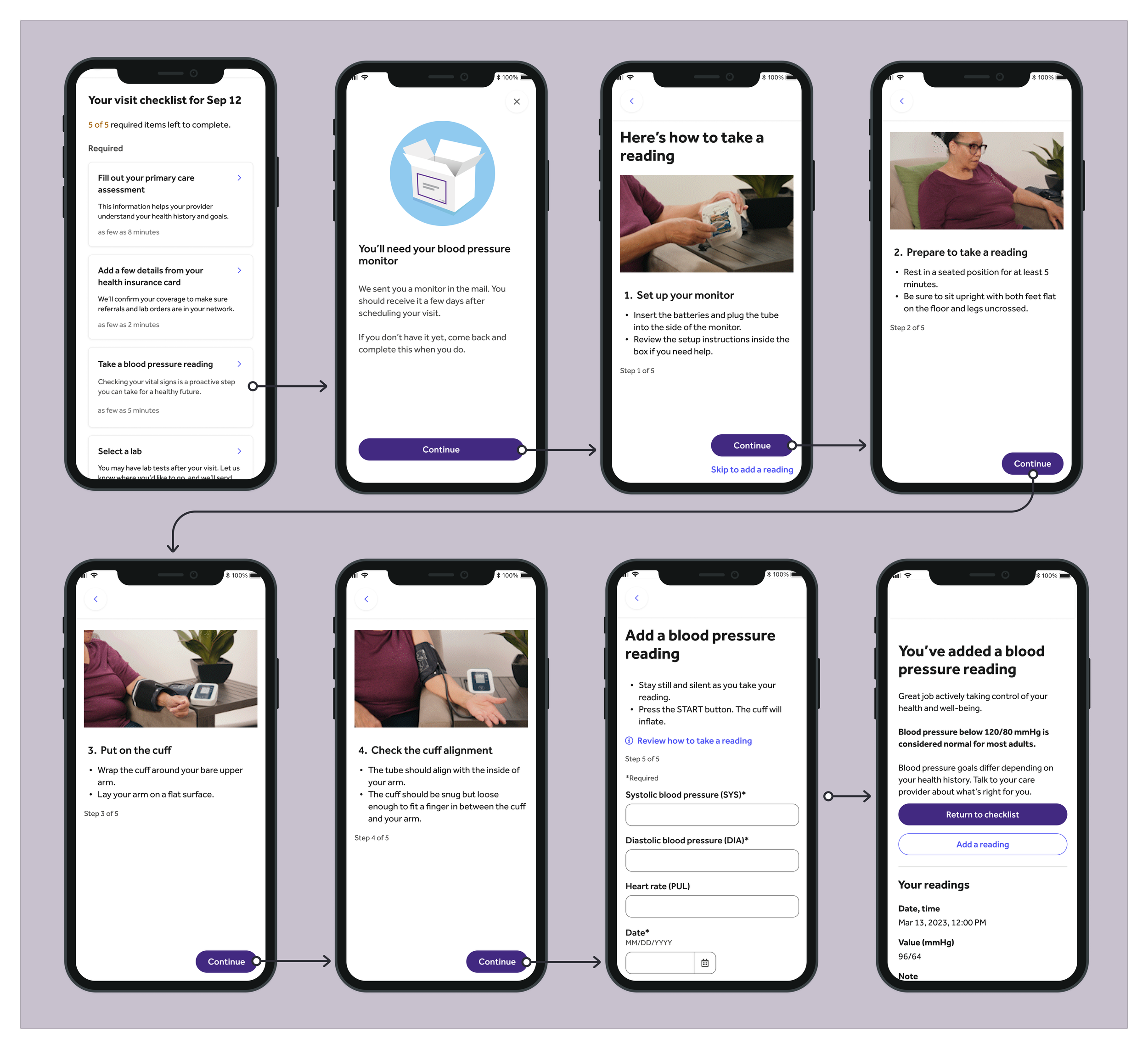
Made blood pressure screening a required task by adding it as the third mandatory item on the PVC.
Refined card messaging for clarity and engagement, emphasizing the most compelling benefit from testing: prevention.
Created step-by-step instructional content by shooting live-action video that we converted into GIFs—the first use of GIFs in the entire app—allowing users to learn at their own pace.
By streamlining the experience and making the process intuitive, we empowered users to take ownership of their health while reducing the burden on care teams.
Outcomes
The impact was immediate and significant:
Self-screening rates increased by 2000%.
Nurses and providers were freed from manual collection and follow-ups, allowing them to focus on more meaningful patient interactions.
This initiative not only improved blood pressure screening rates but also set a new precedent for user engagement and self-service healthcare in Teladoc Health’s virtual primary care experience.