Transitioning a City Website Platform
User Experience Design, Content Strategy
Overview
In local government, opportunities for large-scale modernization are rare - big change happens over time. On my previous team, we started one of those large-scale modernization projects - an entirely new City website following Human-Centered Design standards. The challenge was, it was taking years longer than anticipated. In my new department, I was part of the team that oversaw the existing City website and our Drupal platform needed to be updated before the vision website was completed. We used this opportunity to not only make urgent technical updates but also identified opportunities to start implementing the long term vision immediately.
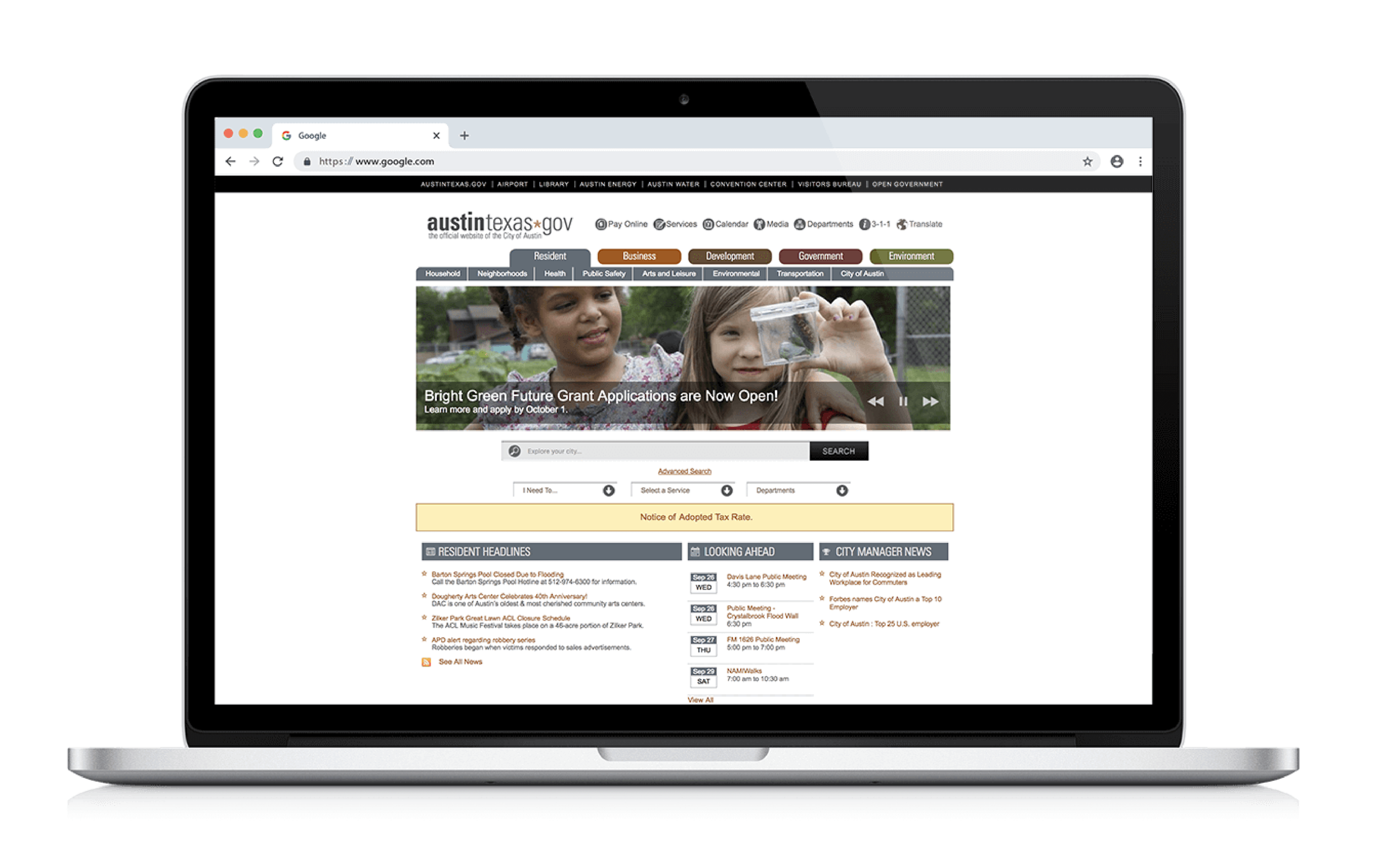
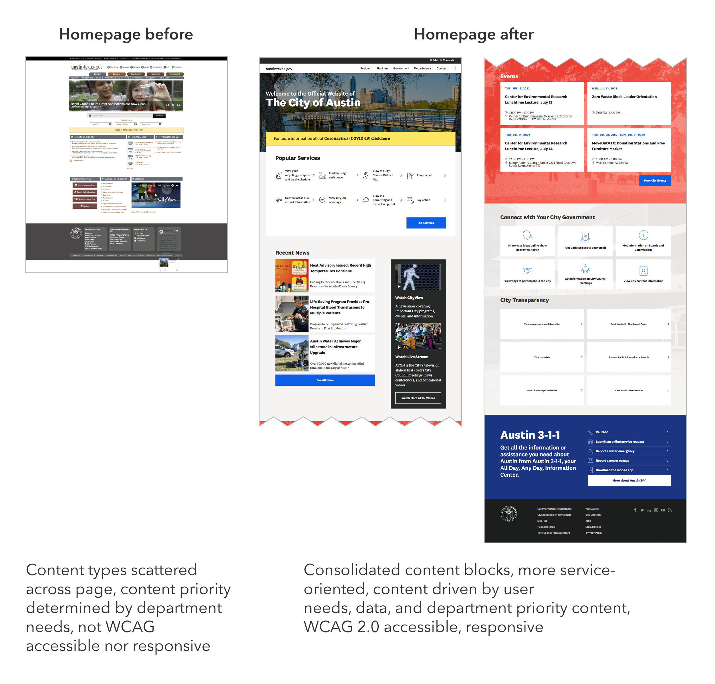
The previous website homepage
Opportunity
The first major website update in a decade.
Make responsive and WCAG-compliant
Improve usability of key global features
Support CMS updates
Enhance analytics collection
Transition website and org culture toward best practices and long-term vision
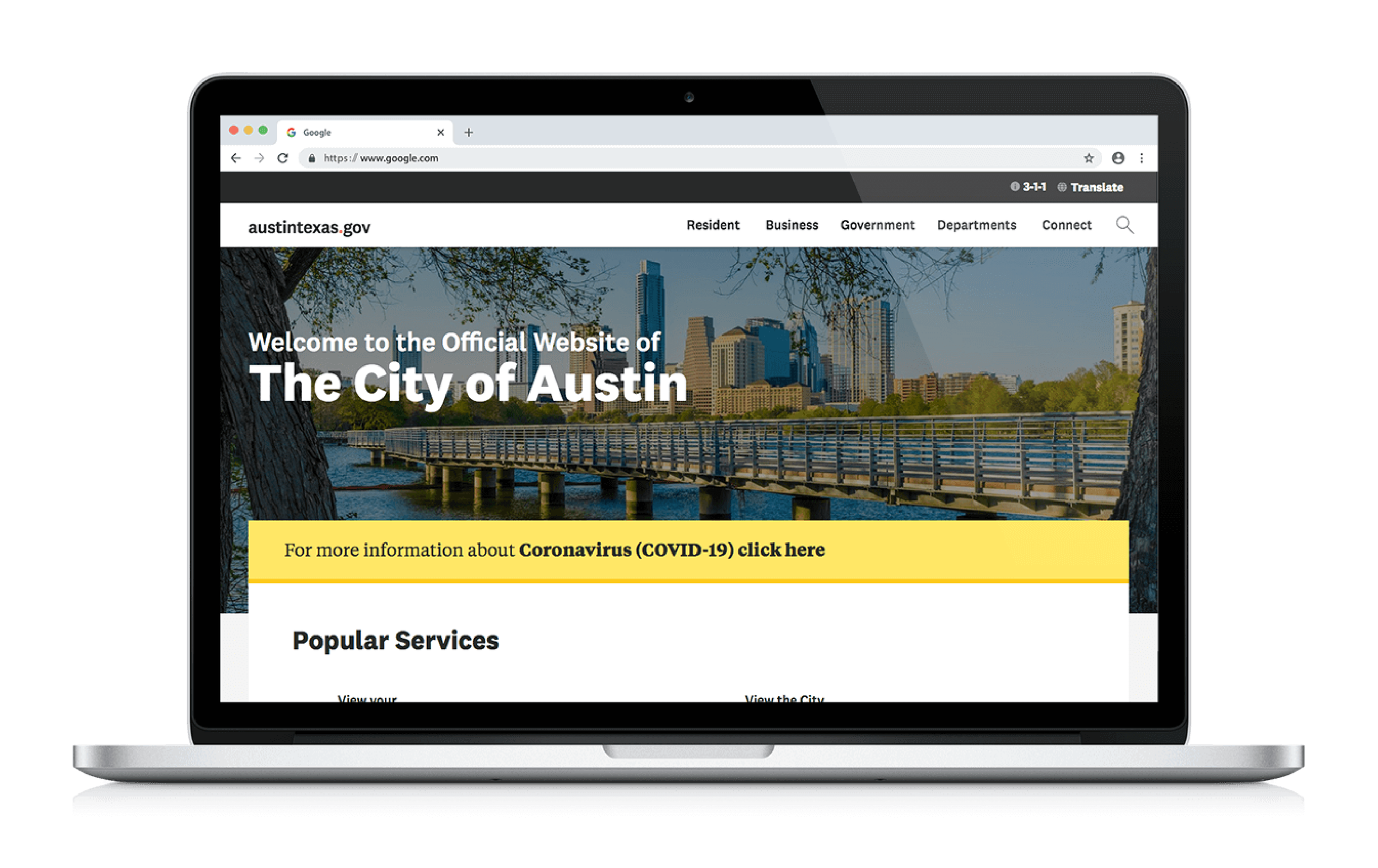
The new website homepage we delivered
Outcomes
Mobile-responsive, accessible sitewide visual design
Improved homepage, Main Menu, Search, and Events Calendar
Content strategy and design standards grounded in Human Centered Design
Enhanced Google Analytics configuration
Prioritized design improvements from usability testing for future development
Updated Content Management System configuration
Impact
Communications Office continues using my Human Centered Design process across the site and other products
Better decision-making organization-wide from improved analytics
New standards onboard department clients to user-centered practices aligned with long-term vision
Team
My role UX design and content strategy on global pages and elements; user research; updating our Google Analytics configuration.
Collaborators Content strategist and Google Analytics collaborator, visual designer, project manager, web admins, internal IT staff, developers.
Highlights
Transitioning the City Website from Old Practices to New
The homepage had no cohesive content strategy; it had become bloated with scattered links and content
The City's homepage reflected years of incohesive, organic development—outdated design and multiple staff contributions. It was the ideal starting point.
Homepage content had been chosen by individual opinions and internal requests, not data or strategy. This caused:
Cluttered, inaccessible links in limited space
Outdated or low-traffic pages featured prominently
High-priority pages missing or poorly phrased
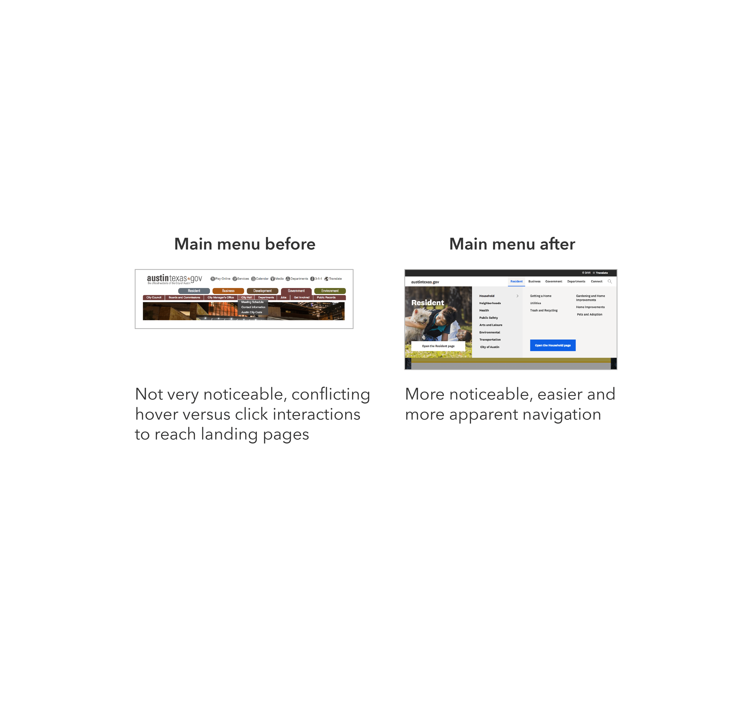
Overlooked interaction patterns
My task: rebuild the homepage with better responsiveness and accessibility. But I aimed higher—identifying immediate steps toward the long-term vision. I couldn't shift the entire culture at once, so I focused on implementable principles:
Prioritize services (what users need most)
Use user language, not department names
Write action-oriented content
Make data-driven content decisions
Using Data to Inform Homepage Content
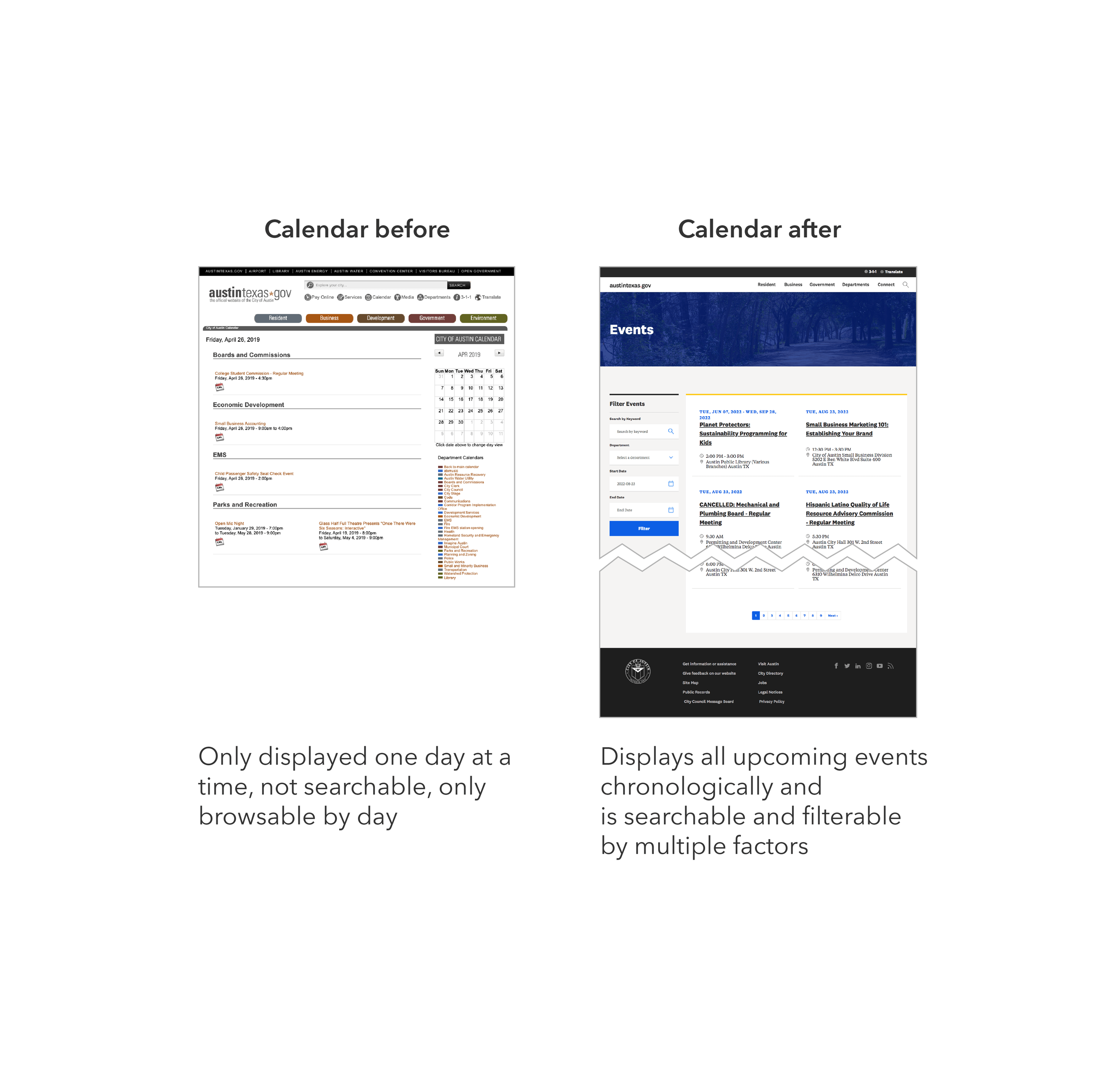
We lacked clear, reliable data sources. Our analytics were incomplete—poor information architecture, navigation, and search meant users weren't finding what they needed through normal paths.
I gathered insights from every available source, blending current and human-centered design standards:
Drupal and Google Analytics
Proof-of-concept vision project research
Organizational data (3-1-1 calls, public surveys)
Colleague expertise
Market research
Legal requirements
Existing internal standards
Example Content Block: Popular Services
Improving Visibility of Higher Priority Content
How the previous homepage addressed displaying service content
Sample wireframes of the new “Popular Services” content block
The previous homepage strategy crammed everything into a single view with minimal scrolling. Two sections—"I Need To…" and "Select a Service"—sat in inconspicuous, redundant menus with years-old links. Since services are users' highest priority, I consolidated these menus into one prominent block displaying 8 services (based on industry research) with a clearer interaction pattern.
Usability testing validated this—most participants scrolled to this block first.
Using Design Principles to Inform Information Hierarchy
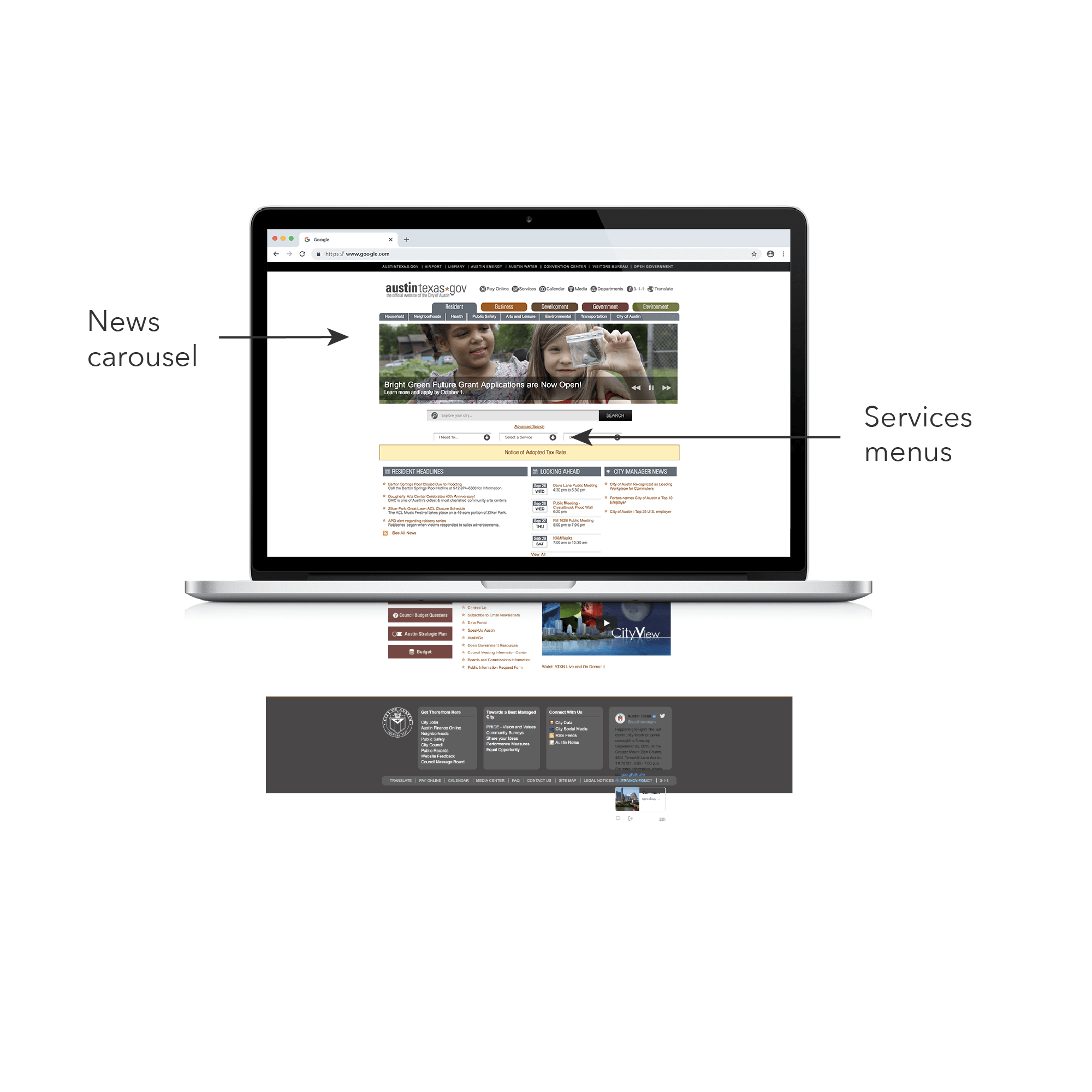
The previous homepage displayed news content before services content
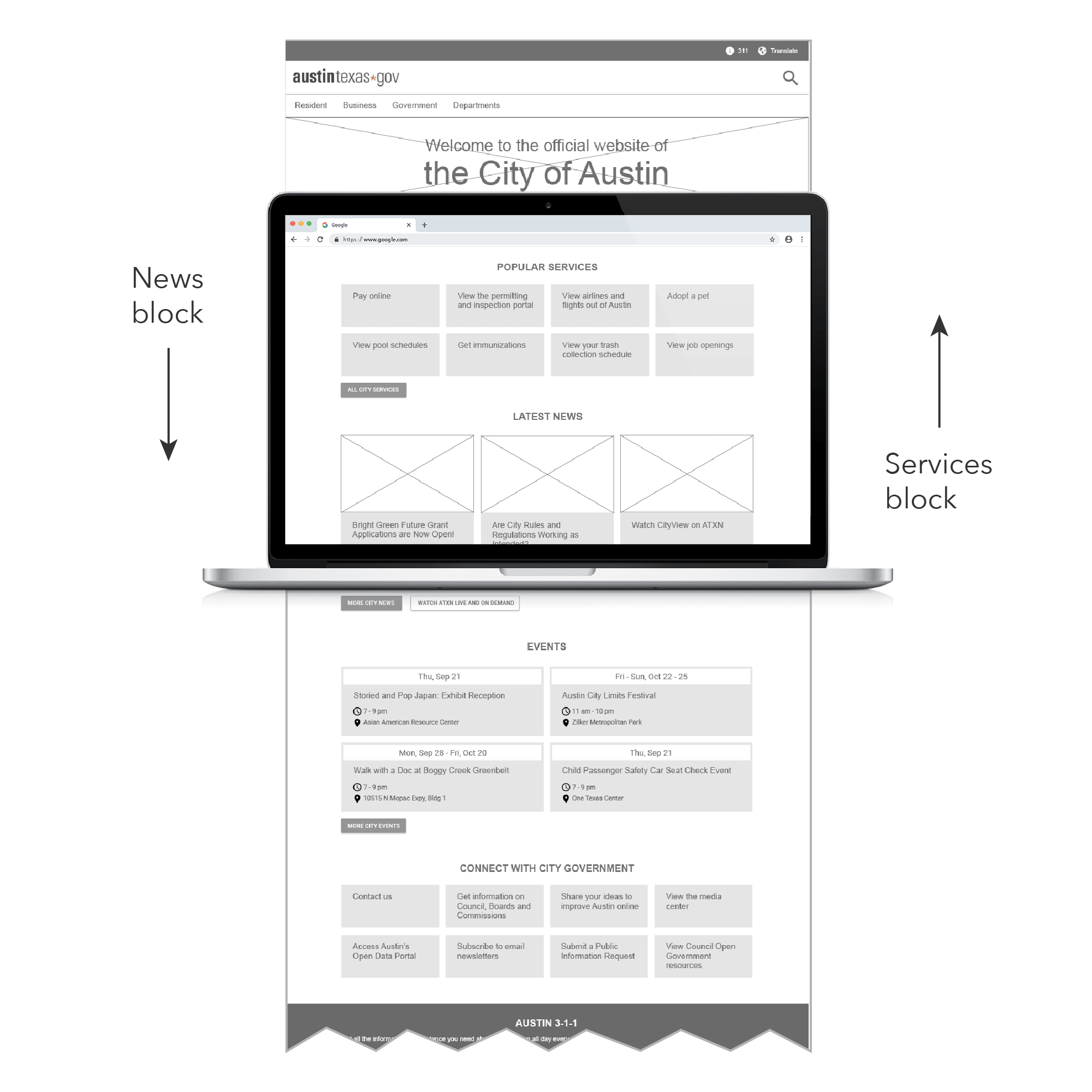
The new homepage displays services content before news content
Next step: improve hierarchy by prioritizing services. The homepage featured a rotating news carousel at the top—internal clients loved it and considered top placement critical. I used industry research showing carousels get low interaction to replace it with tiles and shift to a data-driven approach. Since research showed higher demand for services, I moved services up and news down.
Research suggested most users don't visit for news, so I'd have preferred moving it lower. But internal expectations were strong, so I compromised on second position—preparing clients to eventually support prioritizing higher-need content.
Finding Accurate Data to Make Informed Decisions
My spreadsheet of aggregated data across sources to determine top services. Each color signifies an overlapping service page.
I started with existing analytics but couldn't identify what users needed, so I improved the analytics configuration:
Google Analytics showed top pages, but search analytics weren't configured. A colleague and I set them up for future insights.
Drupal tracked search terms too vaguely to determine user intent. I proposed updates for our new system.
I filled gaps by collaborating with key stakeholders:
3-1-1 help line data on top service requests
Equity Office and Community Engagement teams' input on needed services
I aggregated sources into a spreadsheet and identified patterns:
Strong overlap between Drupal, Google Analytics, and 3-1-1 data
Equity/Community Engagement services had few overlaps—suggesting low findability or awareness
Top links weren't all "services"—some provided other information
Top pages varied seasonally
I also identified top user profiles based on community expert input and years of City human-centered design work.
Consolidating Data into a Cohesive Design
Top accessed services stayed on the homepage and less accessed but equity-focused services were placed in secondary landing pages
Data fell into two types:
Highest-searched services relevant to most Austin residents and visitors
Resources for specific user types—residents needing government services, business community, and civic engagement enthusiasts
I placed the first type in a "Popular Services" block on the homepage. I moved the second to three global pages (Resident, Business, Government) as "Featured Resources."
Popular Services = top-accessed and searched. Featured Resources = high-need but potentially low-awareness. These blocks let us:
Drive traffic and raise awareness
Introduce staff to equity-driven decisions
Track performance over time
I designed blocks similarly for easy adaptation and created seasonal content rotations.
Enabling Continued Evolution Toward the Long-Term Vision
I documented the content strategy, analytics, and design elements in a Web Standards Guidebook, compiled with the Proof of Concept team. Two years later, it still guides ongoing development.
Impact
Communications Office continues using my Human Centered Design process across the site and other products
Better decision-making organization-wide from improved analytics
New standards onboard department clients to user-centered practices aligned with long-term vision