Designing a multi-platform EAP that unifies three healthcare companies
Stakeholder Alignment, Service Design, Product Design
Overview
2026 MedTech Breakthrough Award Winner - Mental Health Innovation
Employee Assistance Programs represent a significant yet underserved segment of the corporate wellness market. Many employers are actively seeking to replace their existing EAPs, frustrated by poor utilization rates, unclear outcomes, and disconnected user experiences. Teladoc Health, in partnership with BetterHelp and CuraLinc, identified a strategic opportunity to enter this market with a differentiated, measurable, and human-centered offering.
Opportunities
Connect 3 platforms into a cohesive, seamless experience
Intuitively integrate non-health services into Teladoc’s healthcare platform
Converting users into paid sessions after using up their free sessions to continue care until their situation is resolved
Outcomes
$4.3M estimated direct revenue impact
200,000 users enabled across clients
$101M sales pipeline unlocked
Team
My role Lead designer at Teladoc Health, embedded across three product organizations. Responsible for end-to-end service design, user experience stakeholder facilitation, and Teladoc-side product design.
Collaborators Product managers, content strategist, clinical strategists, engineering team, marketing team, customer service teams, commercial and sales teams
Timeline
Discovery through final engineering hand-off (MVP): April - July 2025
Cross-functional service opportunity identification, development guidance, design QA, and launch: August - December 2025
Deliverables
Native-mobile (iOS, Android) and responsive web designs
EAP dashboard service entry points and session tracker (Teladoc)
Life & Home Services homepage card and info page
Therapy transfer flow to BetterHelp
Free-to-paid transition flows
22 end-to-end service blueprints across Teladoc, BetterHelp, and CuraLinc
Highlights
The challenge
Fragmented stakeholder landscape
Teams across three companies had overlapping interests, varying technical constraints, and different design and content systems
Several design explorations were done to retain stakeholder feedback and identify where we could streamline, and where there were legal (e.g. HIPAA) or technical barriers
An aggressive timeline meant we had to start working before every stakeholder was defined
User trust at stake
The target users, employees facing personal or professional challenges, are in a vulnerable and stressed state. The experience needed to feel unified and frictionless, not cobbled together from three separate products
Monetization without friction
A free-session model needed to convert to paid without alienating users mid-crisis. This challenge required careful emotional intelligence and clear framing.
How might we create a coherent, smooth user experience across three independently operated platforms, each with its own product team, brand, and technical constraints?
Driving cross-company alignment and shared requirements
The most complex aspect of this project was not the design itself. It was the process of aligning stakeholders who had never worked together, each with legitimate but sometimes competing priorities. Additionally, the Teladoc and BetterHelp product teams were ready to begin before the CuraLinc product team and the Teladoc marketing team, and there was a quickly-approaching sales team deadline, so we felt compelled to make progress while other stakeholders were identified. My approach began with a thorough review of all high-level definition documents, then bringing the right people into a structured cross-company workshop to define initial product experience requirements.
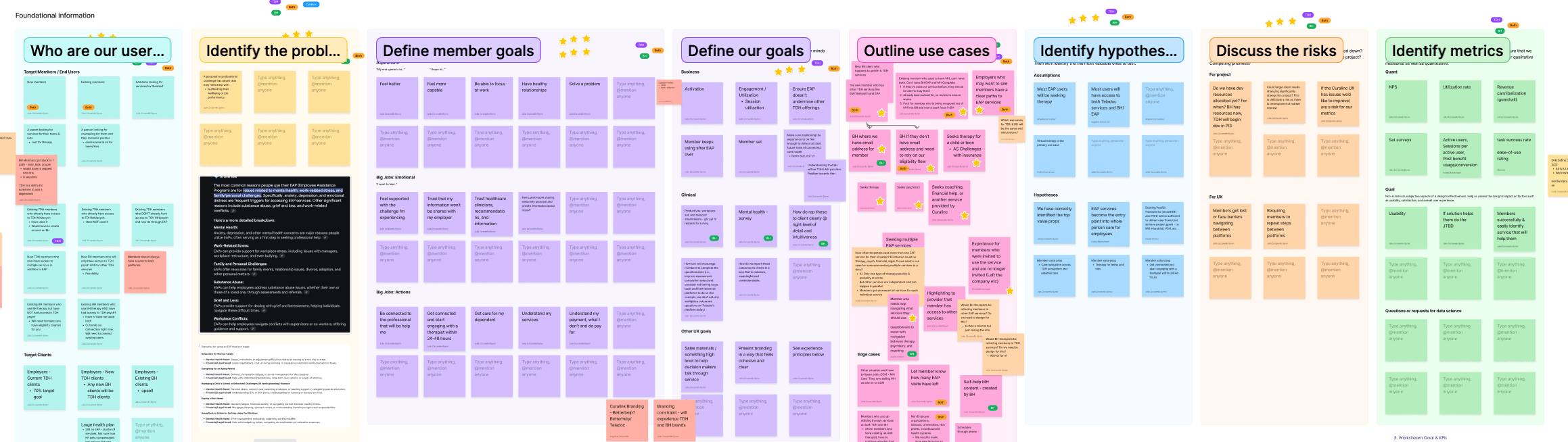
The goal was to build a shared understanding before any design work began by establishing a common language, shared priorities, and aligned success criteria across Teladoc and BetterHelp.
Participants:
Teladoc product team - product manager, design (me), content strategy
BetterHelp product team - product manager, design manager
Teladoc and BetterHelp clinical advisors
Key activities:
Platform deep-dives
Typical performance metrics
End user definition and goal mapping
Assumptions and risks documentation, hypothesis creation
Use case documentation and prioritization
Align project KPIs
High level end-to-end journey mapping
Misaligned assumptions kill projects slowly, through conflicting priorities, scope disputes, and user experiences that feel disjointed. By defining these items and priorities before any screen was designed, this workshop became the foundation for every subsequent design decision. These also helped to provide a guiding light as the rest of the stakeholders onboarded and continued to be refined throughout the project.
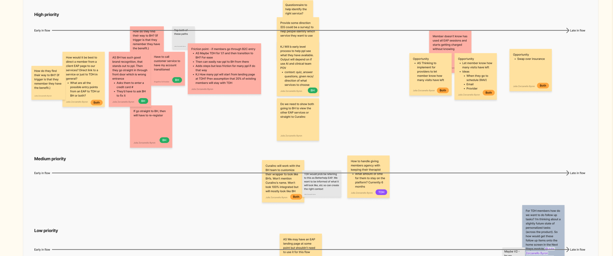
Service blueprints for alignment, gaps, and training
The EAP service spans multiple digital platforms, human touchpoints, and lifecycle stages. I wanted to surface the full end-to-end service for each use case and entry point so that we could ensure a smooth experience between touchpoints and during handoffs.
I used the blueprints as live collaboration tools, creating versions for each use case as I understood them then holding separate meetings with cross-functional collaborators to review and fill them out. When they felt complete, I presented them to our large cross-company stakeholder group along with the recommendations surfaced along the way.
The blueprints served three critical functions beyond design:
Aligned all internal stakeholders across the three companies around a single, agreed view of the service
Streamlined end-to-end service delivery by surfacing redundancies, handoff failures, and opportunities
Training for every staff member involved in delivering and supporting the EAP, from sales to customer service agents
Scope:
I led the service blueprinting initiative and covered the Teladoc and CuraLinc entry points, and mentored the BetterHelp designer in adapting them for their entry points
Initial awareness through ongoing care, mapped against end user and staff actions and interactions, and supporting systems
All three companies
Report with prioritized improvement ideas presented to the entire team, including upper leadership
Top insights and changes:
Marketing proposed having all users go through the Teladoc app to access services; we saw it is much more streamlined to send them from the marketing page directly to BetterHelp if the user is seeking therapy.
Solution: A link directly to BetterHelp therapy services at the beginning of the user journey (marketing materials). | High impact, low effort
During customer service handoffs from CuraLinc to Teladoc, the users would receive the Teladoc phone number, call it, go through the general phone tree, then have to re-explain their situation; tedious and frustrating for users.
Solution: We created a direct customer service phone number, then the CuraLinc agent would do a warm transfer and overview the situation to the Teladoc agent before handoff. | Medium impact, low effort
Each customer service platform was collecting data about inquiries, but there was no way to separate EAP data from overall datasets. We would not be able to learn about issues being reported through customer service, a risk for a novel multi-company service.
Solution: Each company implemented an EAP tag for their data so that we could learn about issues distinct to the EAP program. | Medium impact, low effort
Key design outcomes
A core part of my value was not just designing screens, but knowing which problems to solve first. Through stakeholder alignment, blueprint analysis, and exploration of existing app features, I identified high-impact, low-effort opportunities that would deliver user and business value while meeting aggressive delivery timelines.
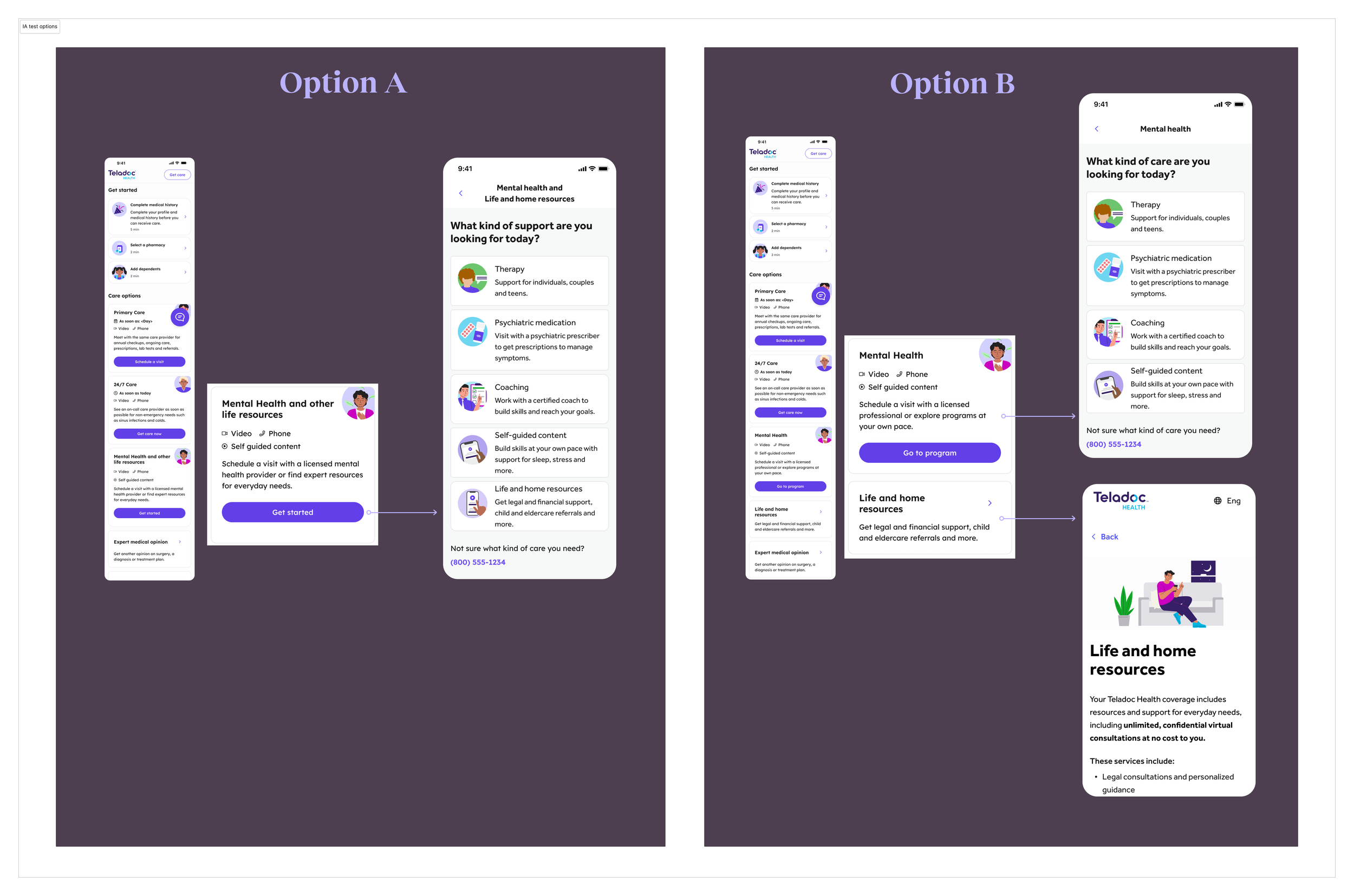
Concepts tested to determine the information architecture of the EAP services
EAP Information Architecture | High impact, medium effort
Problem: Integrating CuraLinc's Life & Home services (legal, financial, childcare, eldercare, more) into a healthcare platform posed a real IA challenge: how do you make non-clinical services findable without undermining users' mental model of a health app?
Approach: I designed multiple concepts and tested them on UserTesting.
The finding was clear: surfacing Life & Home as a distinct service set, rather than consolidating all EAP services on one page, was significantly easier for participants to locate.
Consolidation blurred the distinction between service types and increased cognitive load.
Outcome: Research-validated IA that makes non-health services genuinely discoverable within a healthcare platform, without disrupting the user's mental model of either service type.
The final design placed these services natively alongside all other Teladoc services the user has access to, making them a seamless part of the broader ecosystem rather than an obvious add-on.
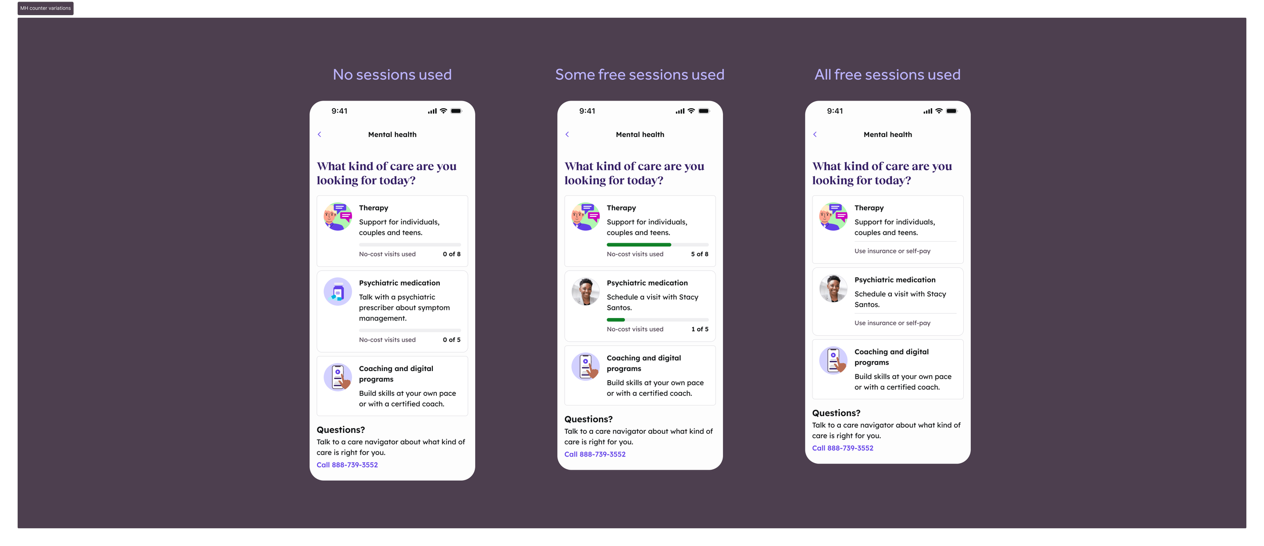
EAP Mental Health Dashboard with Free-to-Paid Session Counter | High impact, medium effort
Problem: This screen served two interconnected purposes: care navigation and session transparency, which were both new to Teladoc's ecosystem.
Approach:
The page was adapted from an existing Teladoc pattern, modified for EAP. Two design departures I chose were consolidating all therapy types into one, rather than following our existing approach of listing each service discretely, to streamline the choice as users would be able to see the discrete options on BetterHelp’s platform. Research validated that this also reduced confusion from seeing two similar-looking dashboards in close succession.
The session counter was a novel addition to Teladoc’s design system. EAP sessions are limited, and approaching that limit mid-treatment is emotionally loaded. The primary design goals were setting expectations and reducing cognitive load so users would be prepared for the change, reducing stress.
After several explorations and a UserTesting study, I designed a tracker that can accommodate up to 32 free sessions (our contract max) and adapts an existing design system component for this new use case.
Outcome: A single, research-validated screen that handles care navigation, cross-platform therapy routing, and the free-to-paid transition all built on adapted existing patterns to minimize engineering effort.
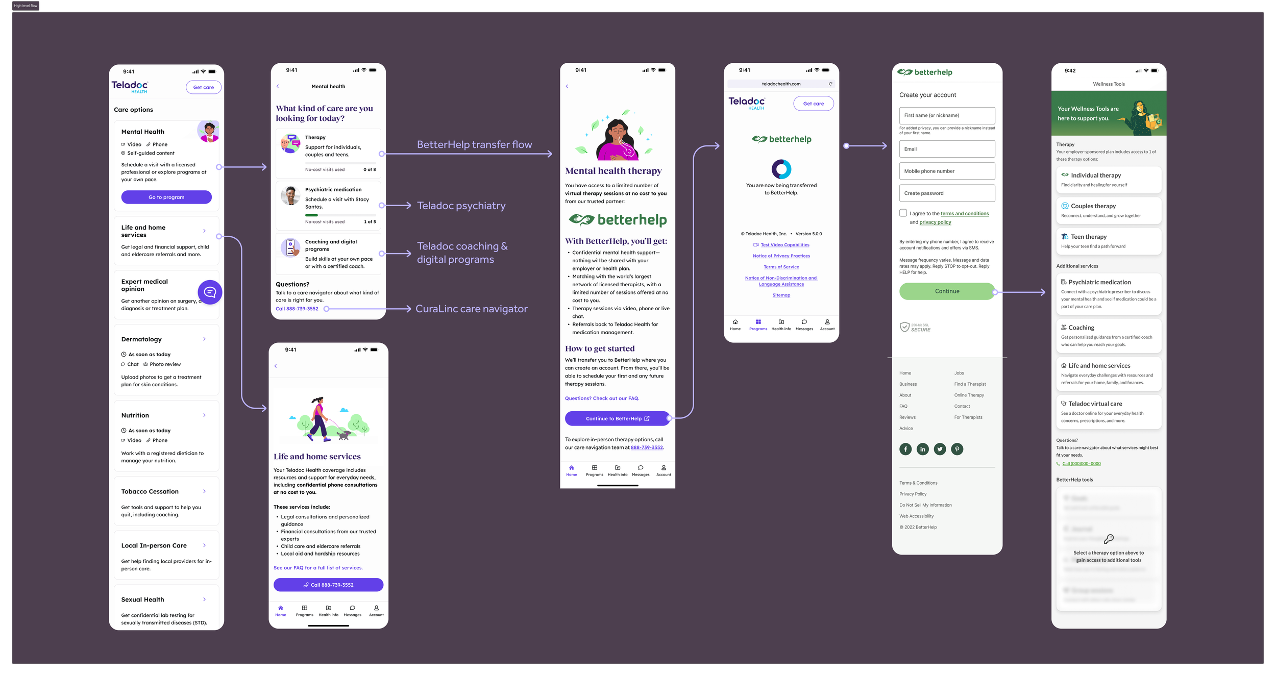
Platform transfer flow to BetterHelp | High impact, medium effort
Problem: Traditional EAPs require users to seek out each service on their own, often from an unclear internal website, creating a disjointed experience and low utilization. We wanted to change the experience to a warm handoff from the same location users access all of their EAP services.
Approach: I identified existing page templates from the company to duplicate for this purpose. It explained what was happening, why BetterHelp was the right next step, and what to expect, reducing anxiety and drop-off at this critical conversion point.
Using UserTesting, I tested the copy and design for trustworthiness and conversion, and it performed very well.
We attempted to implement single-sign-on so that users would not need to create a new account for BetterHelp. Due to legal reasons, we were not able to completely bypass new account creation. But we were able to send some information over that simplified the transition and linked the users’ Teladoc and BetterHelp accounts.
Outcome: A direct transfer to BetterHelp therapy services that provides users clarity and builds trust in the transition between companies.
Outcomes and impact
Outcomes
$4.3M estimated direct revenue impact
200,000 users enabled across clients
$101M sales pipeline unlocked
What made the difference
The commercial outcomes were only achievable because the design process prioritised alignment before output. By investing in stakeholder facilitation, user journeys, and service blueprinting early, we avoided costly rework, surfaced handoff issues before build, and gave all functions across three companies a shared, coherent view of a product spanning 10+ services. Using the blueprints and design mockups as iterative collaboration tools maintained that clarity throughout delivery.
With limited engineering resources, rigorously defining MVP scope and leveraging existing components ensured we built the right things first and moved lower-priority features to the backlog. UserTesting studies on the information architecture and session counter meant design decisions were grounded in evidence, not assumption.