Creating a Forms System for the City of Austin
Research, Service Design, UX Design
Overview
Forms connect residents to government services. So challenging, unusable, or inaccessible forms block access. Unfortunately, the City of Austin has many such forms - paper based, complex or confusing, and incompatible with assistive technologies. I designed a more effective form for my client and improved form creation across the organization.
Opportunities
Design a new process for creating accessible, effective City forms—piloting with the Animal Foster Form, one of our most-visited pages.
Austin Animal Center desperately needs foster volunteers. Of 1,100 annual applicants, only 18% follow through. Boost that number by redesigning their first major touchpoint: the foster form.
Outcomes
A responsive, accessible form supporting the animal fostering service end to end.
A Digital Forms Guide now used across City departments, a best practices community, and procurement of a better forms platform.
Impact
Early indicators were promising:
Usability testing showed higher completion and comprehension rates
Overall sentiment rose to 4.6/5 across all categories
Confidence scores jumped from 3.6 to 4.6/5
I integrated our best practices into the City of Austin's Digital Forms Guide:
Now used across all departments and actively maintained
Spawned a forms best practices community (UX + IT practitioners)
Led to procurement of Formstack, making accessible, workflow-integrated forms easier to build at scale
Team
My role Project lead, UX research, UX design, and client relationship manager.
Collaborators Product manager, content strategist, UX designer from the client department, research assistants, developer, clients, and a mentee.
Case Study
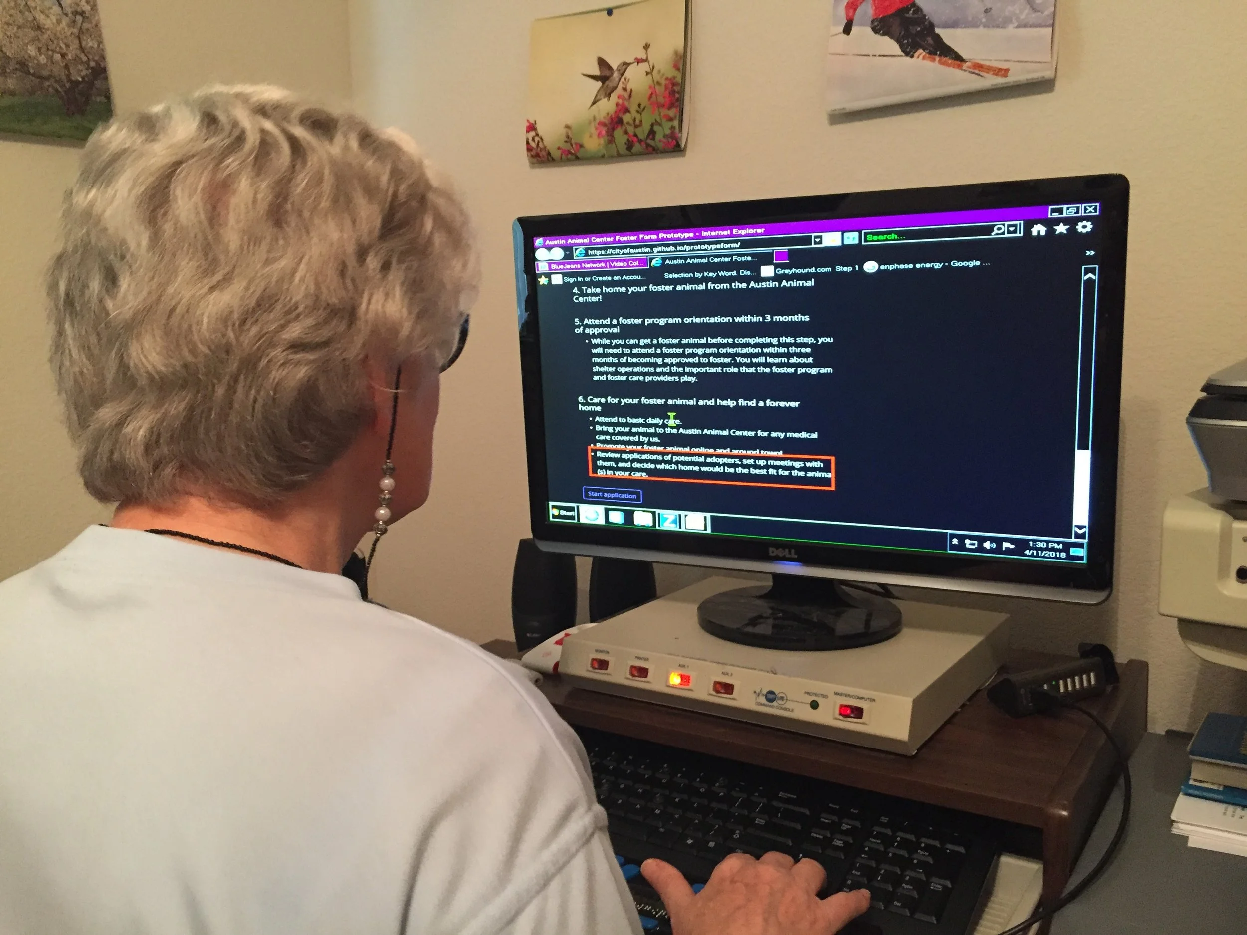
Mismatched expectations led to user drop-off
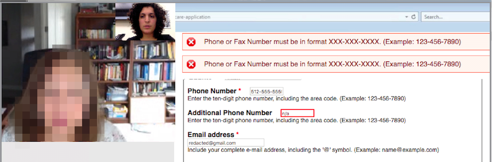
A remote usability test session where the participant struggled with the form’s error handling
Baseline usability testing revealed a critical gap: participants had different expectations of the fostering process, likely causing drop-off.
Key Insights:
Overall sentiment was strong (4.2/5), but confidence in "what happens next" dropped to 3.6. Participants' expected process differed significantly from reality.
Despite high confidence scores, participants misunderstood and answered several questions incorrectly—a major perception vs. reality gap.
Contrary to our hypothesis, participants didn't find the lengthy form frustrating. They felt the length was appropriate given the responsibility and signaled proper vetting by the shelter.
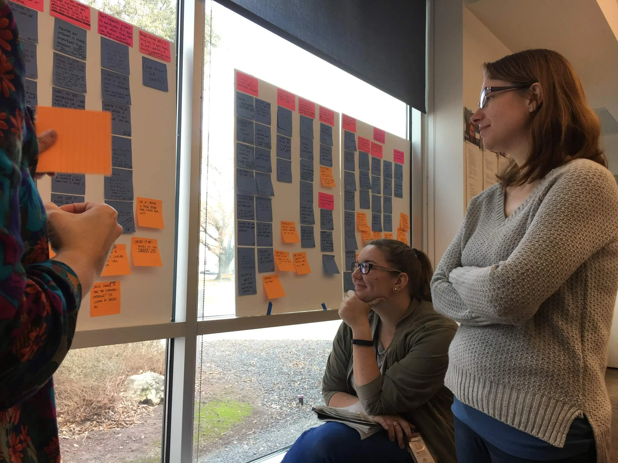
I created a service blueprint to understand how the form fit into the end-to-end process. I realized that it didn't explain next steps—causing approved applicants to miss critical onboarding actions. I redesigned the content to set clear expectations and guide users through the full process.
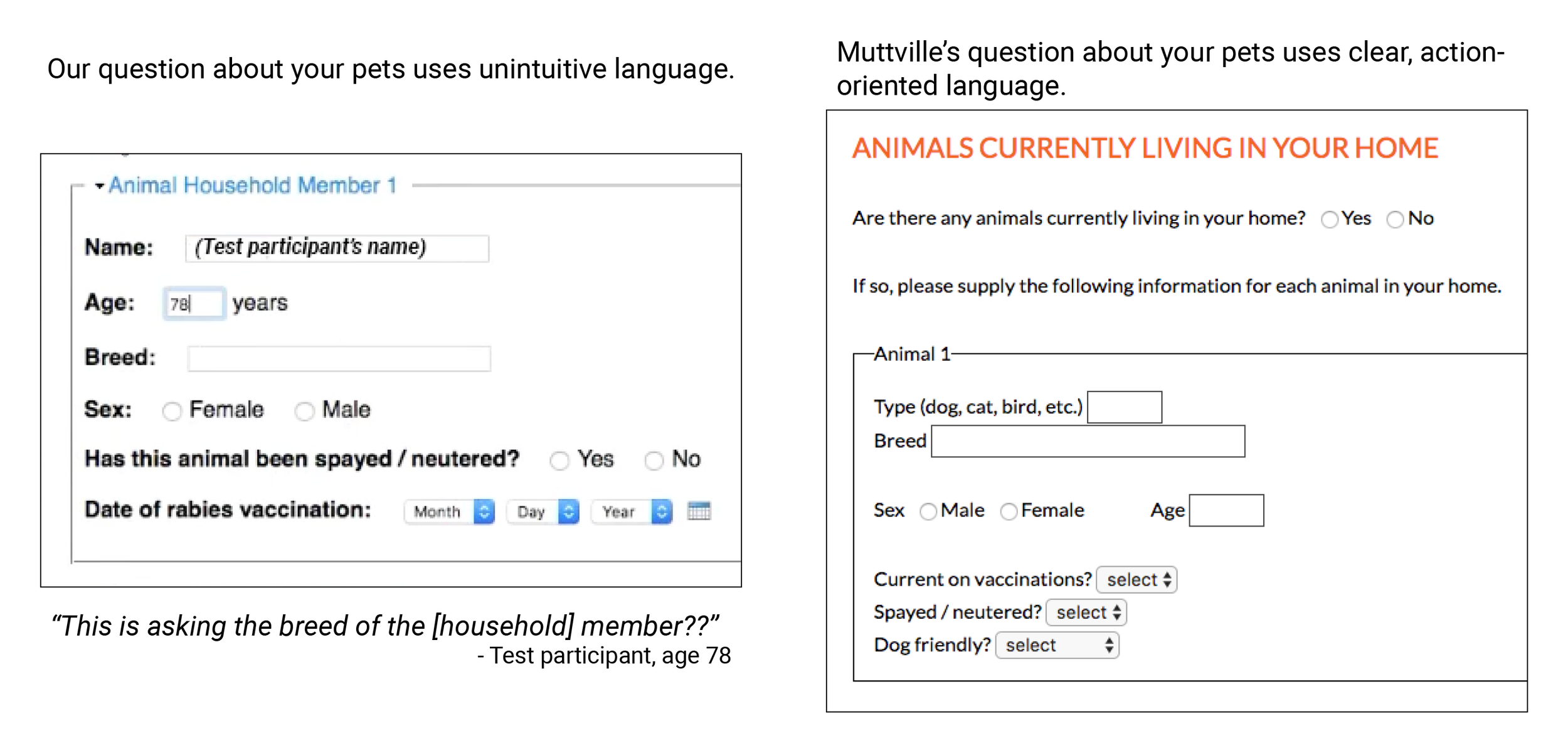
Other shelters use action-oriented, friendly language
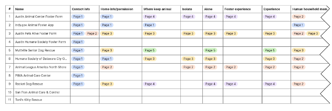
I audited foster forms from local and national shelters, analyzing question topics and organization. Contrary to expectations, successful shelters often included more content than ours—supporting our hypothesis that comprehensive forms possibly could outperform bare-minimum ones in this context.
A sample comparison of our form to another in the market
The audit also suggested that friendlier language may boost conversion despite added length. I also identified more intuitive phrasing and clearer explanations for content participants had misunderstood.
We removed unnecessary content and replaced with friendly expectation setting
Content strategist Court and I stripped superfluous content from the original form, then added process explanations, expectations, and friendlier language. Based on user personas, we determined what to show everyone versus selectively disclose, then determined a new information architecture.
Creating a realistic prototype
Sketch exploration of form components
Conditional logic examples from prototype
I used paper sketching, digital wireframing, and HTML/CSS prototyping. The primary challenge: sharing enough information per user type without overwhelming them. I used progressive disclosure and conditional logic to show relevant questions based on responses, plus expandable sections for those wanting more detail. Color-coded alerts appeared for specific answers.
With developer Mateo, I built a Bootstrap/HTML/CSS prototype, iteratively refining it throughout design. I handled structure and styling; Mateo added JavaScript interactivity. This let us test authentic interactions with low digital literacy and screen reader users—critical since we were unsure about accessibility. The interactions tested well!
Supporting Inclusivity and Accessibility
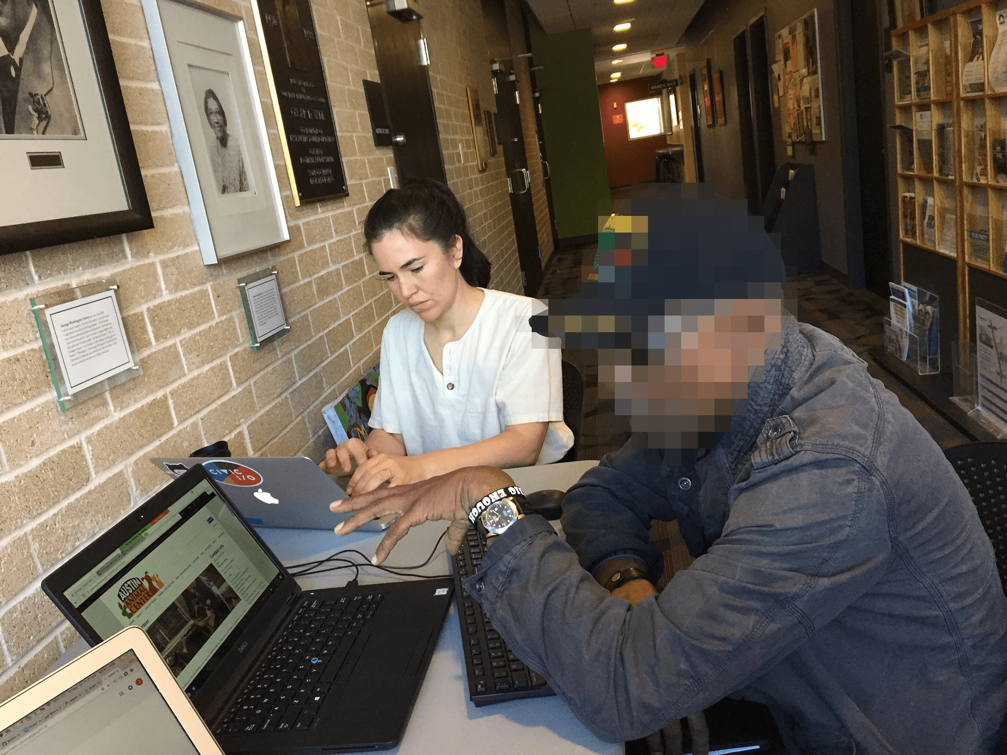
We recruited participants at the public libraries.
Observing a screen reader user.
I built in accessibility from the start: WCAG compliance, web accessibility tool evaluation, and 5th-grade reading level.
To reach Austin's diverse residents—across ethnicity, digital literacy, age, socioeconomic status, and accessibility needs—we tested at libraries serving underrepresented populations and partnered with a disability advocacy nonprofit for visually impaired users. This outreach revealed critical blockers that trapped screen reader and low-digital-literacy users in loops.
Collaborating with Clients
Internal users often resist change—with strained resources, the wrong move could topple a precarious workload. Animal Center staff were initially skeptical of redesigning their known quantity. I brought them into the process, addressed their needs while prioritizing public users, and earned their enthusiastic approval.
Impact
Early indicators were promising:
Usability testing showed higher completion and comprehension rates
Overall sentiment rose to 4.6/5 across all categories
Confidence scores jumped from 3.6 to 4.6/5
I integrated our best practices into the City of Austin's Digital Forms Guide:
Now used across all departments and actively maintained
Spawned a forms best practices community (UX + IT practitioners)
Led to procurement of Formstack, making accessible, workflow-integrated forms easier to build at scale